Adding properties to a custom widget
When you create a custom widget, you need to define the properties that will be displayed for it in the Properties pane.
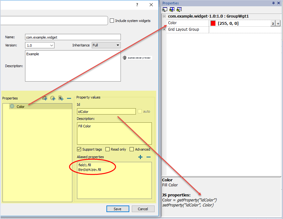
- Right-click on the grouped object and select Widget catalog: the properties dialog is displayed.
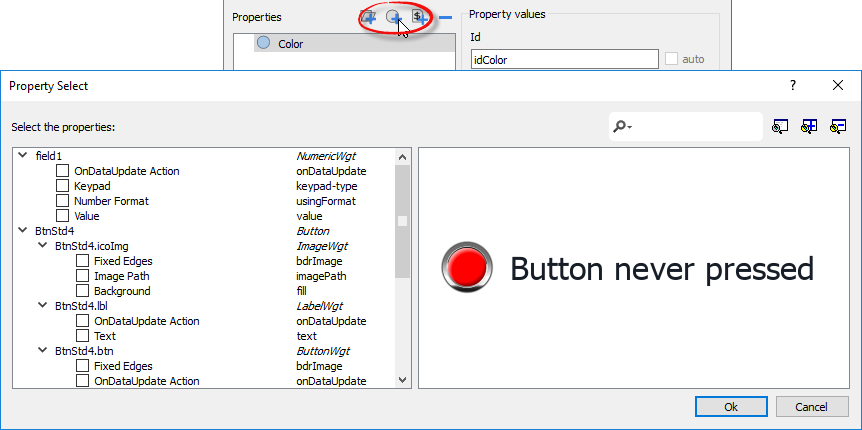
- Click + to open the Property Select dialog: this lists all the properties of all the grouped widgets.
- Select the properties you want to define for your custom widget.
- Define each property's details.
Note that you can create folders and use drag & drop to move or reorganize the Properties list
| Parameter | Description |
|---|---|
|
Properties |
Name shown in the Properties pane. |
|
Description |
Any comment on the property to be displayed in the Properties pane. |
|
Id |
The name exposed by JMobile Studio, to JavaScript functions and Attach Tag dialog. |
|
Support Tags |
Specifies if the property supports the “Attach to" attribute. |
| Read only | Property exposed only in read mode |
|
Advanced |
Specifies whether each property should appear in the advanced, or in the simple view mode of the Properties pane. |
|
Aliased properties |
Internal properties linked with the exposed property |
Combining properties
To combine two or more properties:
- Select the primary property in the Properties list dialog.
- Click + in the Aliased properties toolbar: the Property Select dialog is displayed.
- Select the properties you want to combine.
- Click OK: the combined attributes will be shown in the Aliased properties list box.
Example
If you insert into a “Color” property the fill color of all widgets (e.g. filed1.fill and BtnStd4.btn.fill) when you set the exposed Color property of the custom widget all colors of the included widgets will changes.
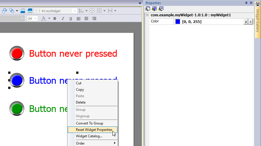
Reset Widget Properties
The "Reset Widget Properties" reset the modified properties values to original values.