Consumption Meter widget
Path: Widget Gallery> Basic> Trends/Graphs
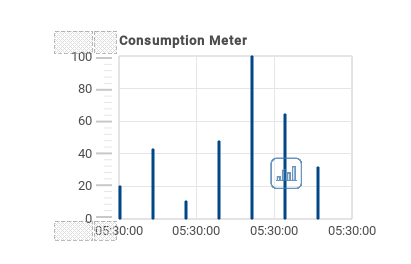
Use this widget to monitor a resource which is continuously increasing. The system reads the value of the resource and calculates the increment in a set range of time, the increment is then displayed in a bar-graph in a trend-like window.
Different colors can be used to used in the graph based on the time frame.
Tip: Use this widget to calculate the power consumption of a system.
| Parameter | Description |
|---|---|
|
Value |
Resource monitored |
|
Graph Duration |
Time period displayed in the window |
|
Bar Duration |
Time period represented by each bar in the graph
|
|
Time Periods |
Assigns a specific color to highlight the increment of the monitored resource in a specified time period (minimum resolution = 1 hour). |
| Color Bar Width |
Bar color and width |
| Bar Value | Show/Hide the value of each bar |
| Consumption Meter | Number of labels to be displayed on graph. |
Example: how to monitor energy consumption
In the following example a widget is design tho monitor energy consumption with a weekly scale and a daily unit.
- Attach a tag to the physical variable to monitor. In this example, to the total energy consumed (Tag KWh). This tag contains an incremental number that indicates how many KW/h have been consumed from when energy consumption started.
- Add a Trend and link it to the tag to be monitored, Tag KWh.
- Add a Consumption Meter widget to a page.
- Attach the Value property of the Consumption Meter to the Trend you created in step 2.
- Set Graph Duration/Units to 1 week: this will give you a weekly graph of consumed energy.
- Set Bar Duration/Units to 1 day, this is the time range when energy consumption is calculated.
- In Consumption Meter set the number of labels to show in the bar graph, in this case 7 to display a weekly graph.
- From the Time Periods property open the Configure Time Periods dialog: set the different colors for different values of Tag KWh in each bar.
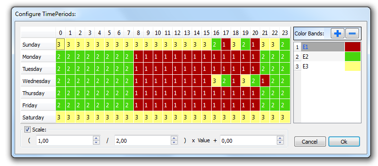
Tip: To assign the color to the cells of the table, select the cells and click on the desired color, or enter the index value of the band (1, 2, 3) into the cell.
- Add as many color bands as you need, in this example 3 color bands.
- Assign a band to each hour in the weekly table, in this example a red band (E1) is used to indicate the range of time in the day/week where the cost of energy is the highest.
Note: You can apply a scale factor to each color band, if needed.
The result is a bar graph consumption meter showing daily consumption of energy in KW/h, with colors indicating the different energy costs. The height of each bar represents the amount of energy in the time range considered, 1 day in this example.
Use the action ConsumptionMeterPageScroll to scroll the bar graph back and forth and the action RefreshTrend to refresh the bar graph since data is not refreshed automatically.
Important: No other Trend action is currently supported by the Consumption Meter widget.